Default Theme
Zephyr provides a set of default theme constraints, so you can start styling with zero configuration. You can easily customize/extend the theme (see Extending the Theme), but don't have to to get started with Zephyr.
This document outlines the default theme provided out of the box. It is heavily inspired by TailwindCSS's default theme, with some modifications appropriate for React Native. The code that defines this default theme can be found here.
Default Spacing Constraints
The spacing constraints apply to anything space/size related, such as the margin classes, the padding classes, the sizing classes, and the positioning classes. Here's the scale for the default sizing constraints.
| Name | Size |
|---|---|
0 (ex: w:0) | 0 |
pt (ex: w:pt) | 1 |
0.5 (ex: w:0.5) | 2 |
1 (ex: w:1) | 4 |
1.5 (ex: w:1.5) | 6 |
2 (ex: w:2) | 8 |
2.5 (ex: w:2.5) | 10 |
3 (ex: w:3) | 12 |
3.5 (ex: w:3.5) | 14 |
4 (ex: w:4) | 16 |
5 (ex: w:5) | 20 |
6 (ex: w:6) | 24 |
7 (ex: w:7) | 28 |
8 (ex: w:8) | 32 |
9 (ex: w:9) | 36 |
10 (ex: w:10) | 40 |
11 (ex: w:11) | 44 |
12 (ex: w:12) | 48 |
14 (ex: w:14) | 56 |
16 (ex: w:16) | 64 |
20 (ex: w:20) | 80 |
24 (ex: w:24) | 96 |
28 (ex: w:28) | 112 |
32 (ex: w:32) | 128 |
36 (ex: w:36) | 144 |
40 (ex: w:40) | 160 |
48 (ex: w:48) | 192 |
56 (ex: w:56) | 224 |
64 (ex: w:64) | 256 |
72 (ex: w:72) | 288 |
80 (ex: w:80) | 320 |
96 (ex: w:96) | 384 |
1/4 (ex: w:1/4) | 25% |
1/2 (ex: w:1/2) | 50% |
3/4 (ex: w:3/4) | 75% |
1/3 (ex: w:1/3) | 33.33333% |
2/3 (ex: w:2/3) | 66.66666% |
1/5 (ex: w:1/5) | 20% |
2/5 (ex: w:2/5) | 40% |
3/5 (ex: w:3/5) | 60% |
4/5 (ex: w:4/5) | 80% |
full (ex: w:full) | 100% |
Default Colors
The default colors consist of white: #fff, black: #000, and the following colors.
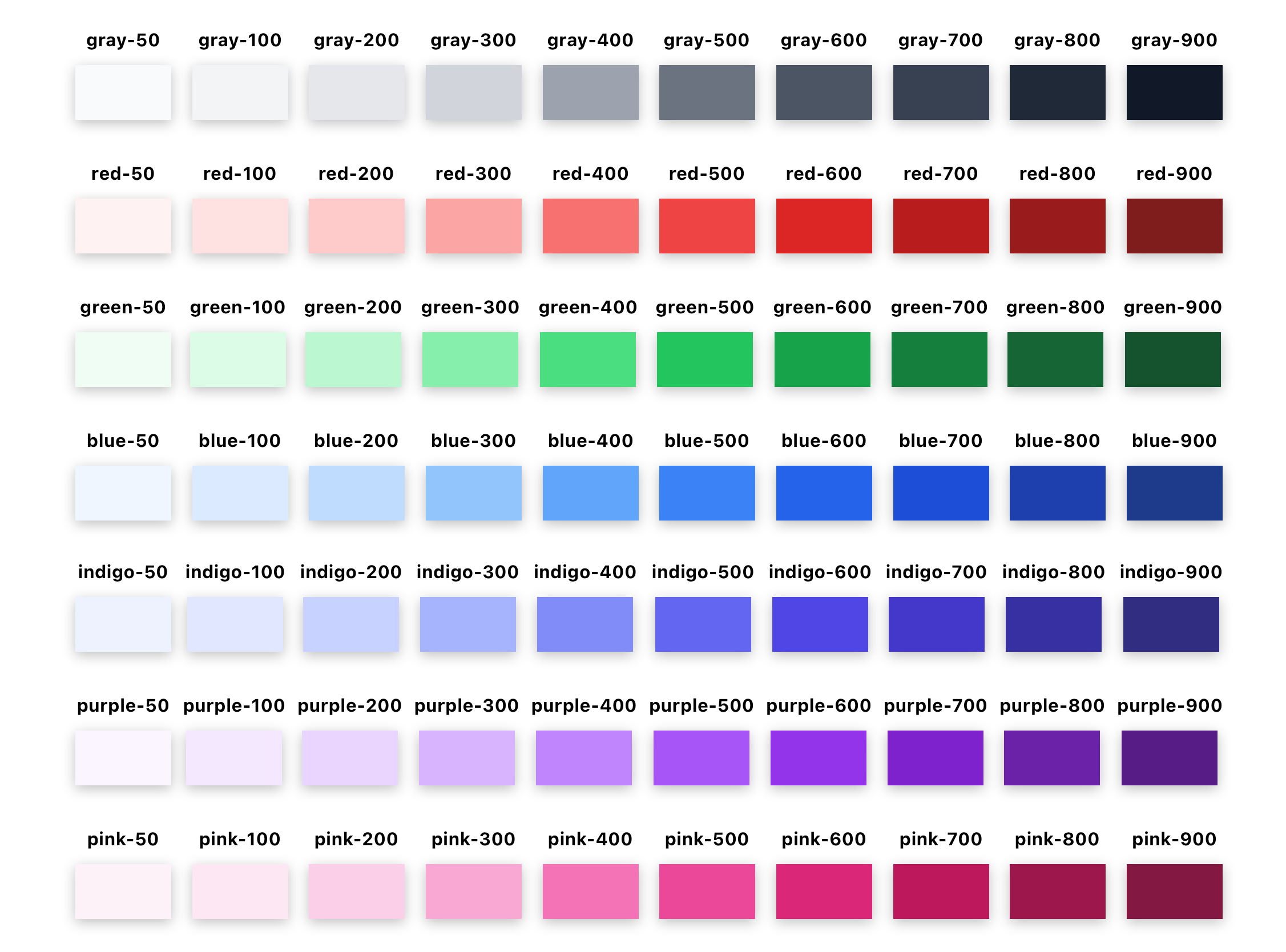
Check out the Extending the Color Palette for information on how to extend this color palette with other pre-defined colors borrowed from TailwindCSS's palette.
Default Opacities
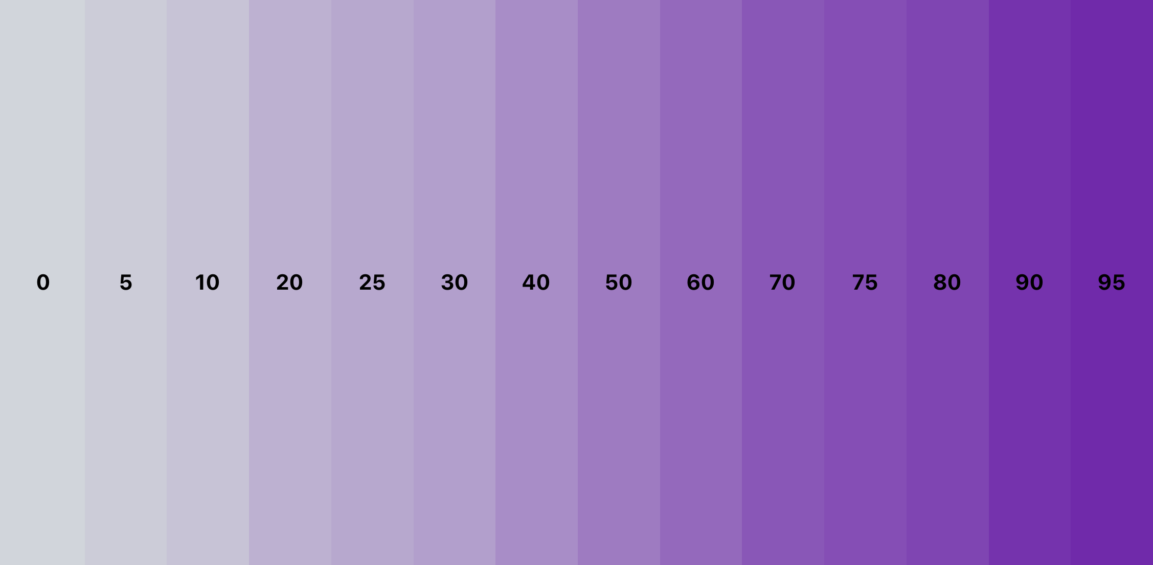
The opacities constraint applies to opacity and background opacity (which is opacity applied only to the background, not all elements). Here's the default opacities constraint scale.
| Name | Value |
|---|---|
0 | 0 |
5 | 0.05 |
10 | 0.1 |
20 | 0.2 |
25 | 0.25 |
30 | 0.3 |
40 | 0.4 |
50 | 0.5 |
60 | 0.6 |
70 | 0.7 |
75 | 0.75 |
80 | 0.8 |
90 | 0.9 |
95 | 0.95 |
Here's a visual representation of that scale.
Default Border Sizes
The borderSizes theme constraint applies to the border width classes. The scale for this is:
| Name | Size |
|---|---|
0 | 0 |
hairline | StyleSheet.hairlineWidth |
1 | 1 |
2 | 2 |
4 | 4 |
8 | 8 |
Here's a visual representation of that scale.

Default Border Radii
The borderRadii constraint applies to the border radius classes. The scale is based off of the base font size for the default constraints, which is baseFontSize = 14. The scale is as follows:
| Name | Size |
|---|---|
none | 0 |
sm | 0.125 * baseFontSize |
base | 0.25 * baseFontSize |
md | 0.375 * baseFontSize |
lg | 0.5 * baseFontSize |
xl | 0.75 * baseFontSize |
2xl | baseFontSize |
3xl | 1.5 * baseFontSize |
full | 999 |
Here's a visual representation of that scale.

Default Font Sizes
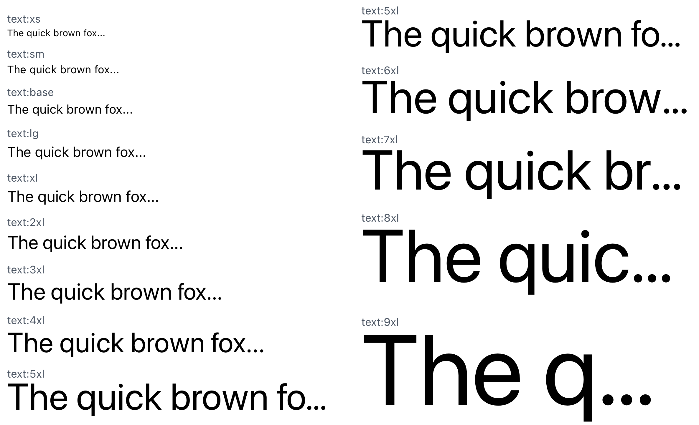
The fontSizes constraint applies to the font size classes. The scale is based off of the base font size for the default constraints, which is baseFontSize = 14. The scale is as follows:
| Name | Size |
|---|---|
xs | [0.75 * baseFontSize, baseFontSize] |
sm | [0.875 * baseFontSize, 1.25 * baseFontSize] |
base | [baseFontSize, 1.5 * baseFontSize] |
lg | [1.125 * baseFontSize, 1.75 * baseFontSize] |
xl | [1.25 * baseFontSize, 1.75 * baseFontSize] |
2xl | [1.5 * baseFontSize, 2 * baseFontSize] |
3xl | [1.875 * baseFontSize, 2.25 * baseFontSize] |
4xl | [2.25 * baseFontSize, 2.5 * baseFontSize] |
5xl | [3 * baseFontSize, 3 * baseFontSize] |
6xl | [3.75 * baseFontSize, 3.75 * baseFontSize] |
7xl | [4.5 * baseFontSize, 4.5 * baseFontSize] |
8xl | [6 * baseFontSize, 6 * baseFontSize] |
9xl | [8 * baseFontSize, 8 * baseFontSize] |
Here's a visual representation of that scale.
Default Font Weights
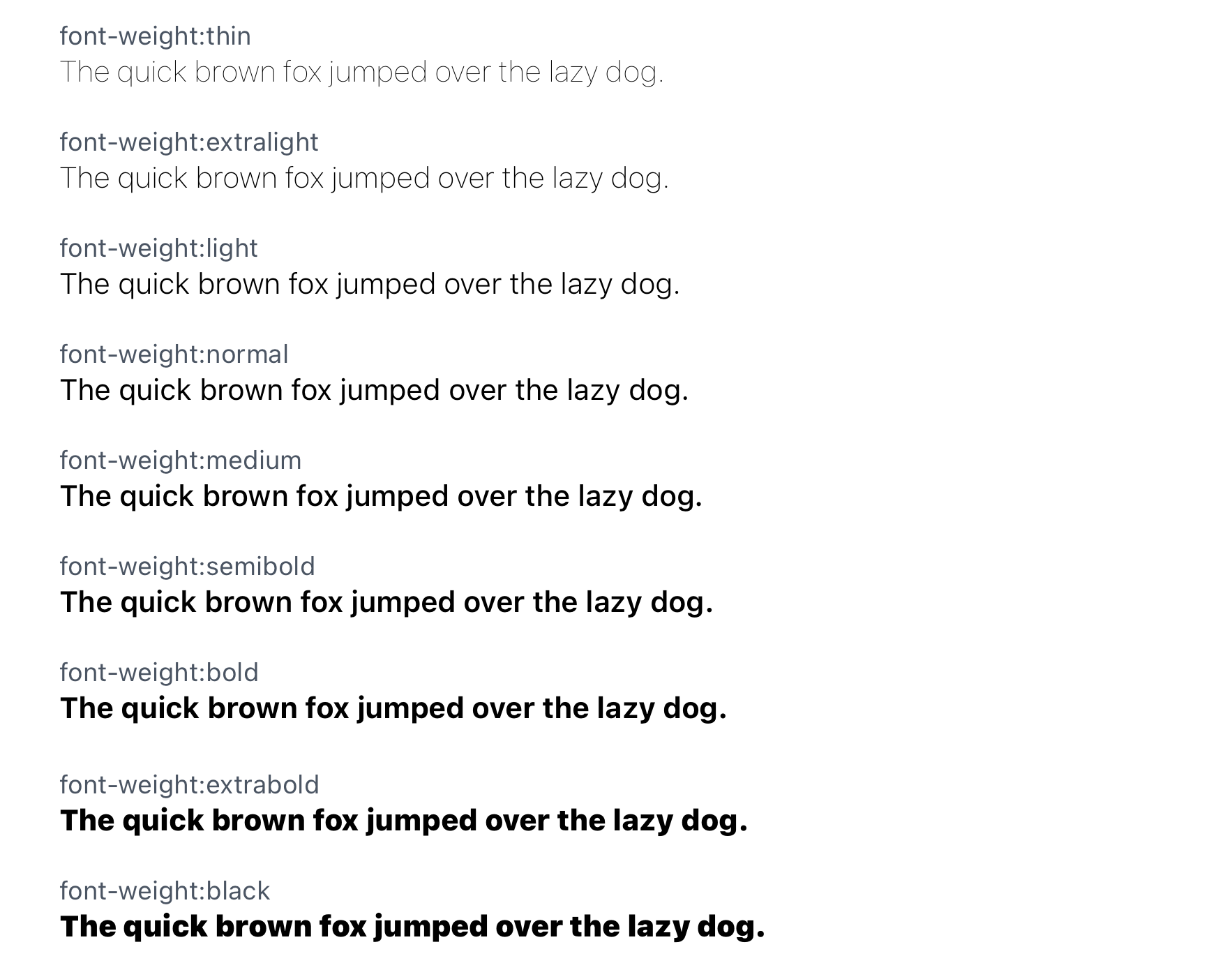
The fontWeights constraint applies to the font weight classes. The scale for this is:
| Name | Value |
|---|---|
thin | 100 |
extralight | 200 |
light | 300 |
normal | 400 |
medium | 500 |
semibold | 600 |
bold | 700 |
extrabold | 800 |
black | 900 |
Here's a visual representation of that scale.
Default Letter Spacing
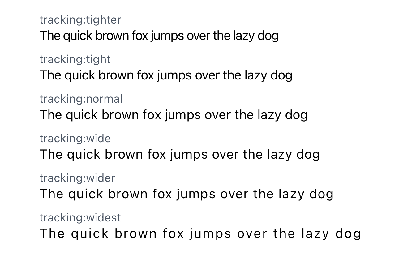
The letterSpacing constraint applies to the tracking: classes. The scale for this is:
| Name | Value |
|---|---|
tighter | -0.05 * baseFontSize |
tight | -0.025 * baseFontSize |
normal | 0 |
wide | 0.025 * baseFontSize |
wider | 0.05 * baseFontSize |
widest | 0.1 * baseFontSize |
Here's a visual representation of that scale.
Default Line Heights
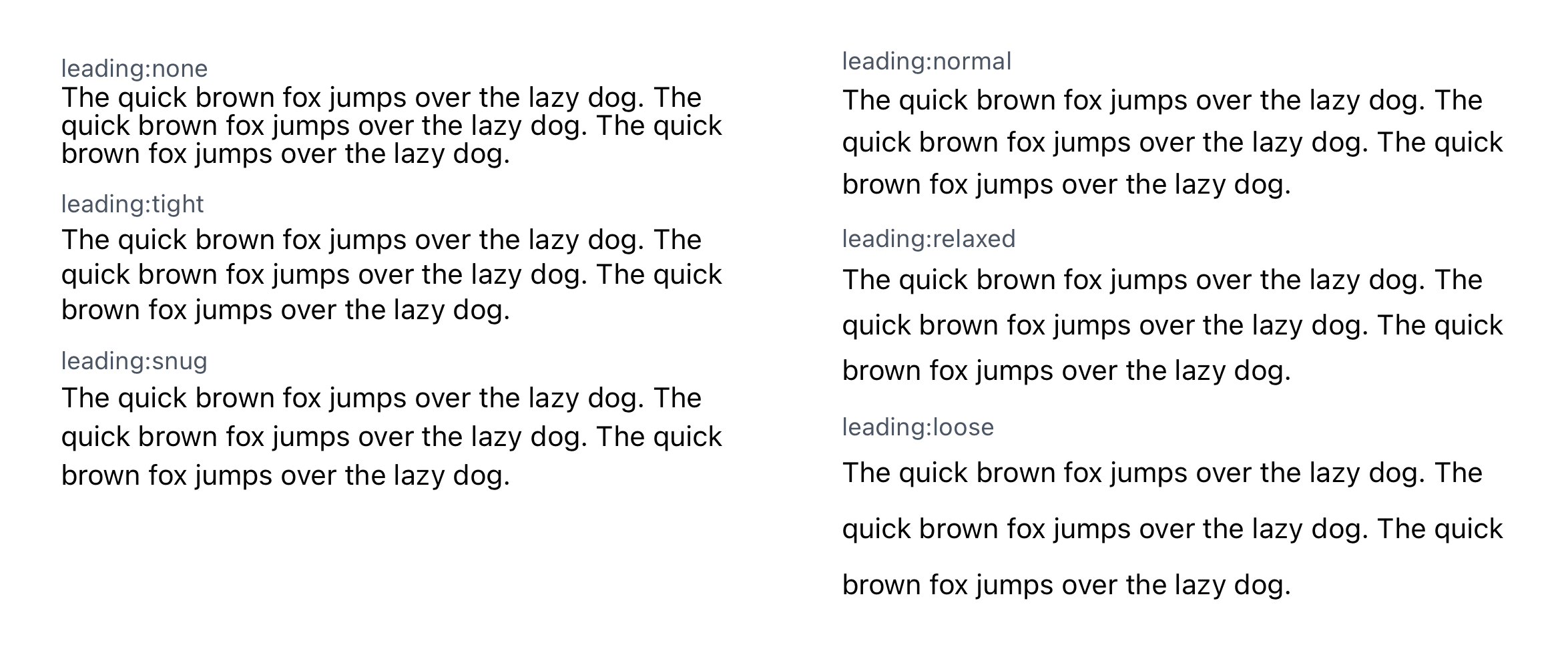
The lineHeights constraint applies to the leading: classes. The scale for this is as follows, where currentFontSize represents the font size of the text element that the class is being applied to.
| Name | Value |
|---|---|
none | 1 * currentFontSize |
tight | 1.25 * currentFontSize |
snug | 1.375 * currentFontSize |
normal | 1.5 * currentFontSize |
relaxed | 1.625 * currentFontSize |
loose | 2 * currentFontSize |
Here's a visual representation of that scale.
Default Shadows
The shadows constraint applies to the shadow classes. The scale for this is:
| Name | Value |
|---|---|
sm | { android: 1, ios: [0, 1, 1, 0.18] } |
base | { android: 2, ios: [0, 1, 1.41, 0.2] } |
md | { android: 5, ios: [0, 2, 3.84, 0.25] } |
lg | { android: 8, ios: [0, 4, 4.65, 0.3] } |
xl | { android: 12, ios: [0, 6, 7.49, 0.37] } |
2xl | { android: 16, ios: [0, 8, 10.32, 0.44] } |
Here's a visual representation of that scale.

Default Aspect Ratios
The aspectRatios constraint applies to the aspect ratio classes. The scale for this is as follows, where [16, 9] represents a 16-9 aspect ratio.
| Name | Value |
|---|---|
1 | [1, 1] |
16-9 | [16, 9] |
9-16 | [9, 16] |
3-4 | [3, 4] |
4-3 | [4, 3] |
1-2 | [1, 2] |
2-1 | [2, 1] |
Here's a visual representation of that scale.
